Mastering Responsive Email Design: A Comprehensive Guide with Adobe Dreamweaver
Introduction: In today’s digital age, email remains a cornerstone of communication, marketing, and business outreach. Crafting visually appealing and functional email templates that adapt seamlessly across various devices is essential for engaging audiences and driving conversions. Adobe Dreamweaver, a powerful web development tool, offers a robust set of features to create responsive email templates that look great on any screen size. In this extensive guide, we’ll explore the intricacies of responsive email design and demonstrate how to leverage Adobe Dreamweaver to create stunning email templates that captivate your audience.
Understanding Responsive Email Design: Responsive email design is the practice of creating email templates that automatically adjust their layout, content, and formatting to provide an optimal viewing experience across different devices, including desktops, laptops, tablets, and smartphones. Unlike traditional web design, designing for email presents unique challenges due to the varied rendering capabilities of email clients and the constraints imposed by HTML and CSS support. However, by adhering to best practices and utilizing responsive design techniques, you can ensure that your email templates look polished and professional on any device.
Step 1: Planning Your Email Template Before diving into the design process, it’s crucial to outline the structure and content of your email template. Consider the following factors when planning your template:
- Define your target audience and the purpose of your email campaign.
- Determine the primary message or call-to-action you want to convey.
- Sketch a rough layout of your email template, including sections for header, body content, images, and footer.
- Keep your design clean, concise, and visually appealing to grab the recipient’s attention and encourage engagement.
Step 2: Setting Up Your Dreamweaver Workspace Once you have a clear vision of your email template, it’s time to launch Adobe Dreamweaver and set up your workspace for email design. Follow these steps to configure Dreamweaver for responsive email design:
- Create a new HTML document in Dreamweaver.
- Define the basic structure of your email template using HTML tags, including <head>, <body>, and <table> elements.
- Configure Dreamweaver’s preferences for HTML and CSS to ensure compatibility with email standards and best practices.
- Familiarize yourself with Dreamweaver’s code editing tools and features, such as code hints, syntax highlighting, and code validation, to streamline the design process.
Step 3: Designing Your Email Template With your workspace configured, it’s time to start designing your email template in Dreamweaver. Follow these guidelines to create a responsive layout that adapts to different screen sizes:
- Use tables for layout: Since many email clients have limited support for CSS, tables provide a reliable method for creating complex layouts that render consistently across platforms.
- Inline CSS styles: To ensure compatibility with email clients, apply CSS styles directly to HTML elements using inline styles rather than external style sheets.
- Optimize images: Minimize image file sizes and use the “alt” attribute to provide descriptive text for images, improving accessibility and rendering consistency.
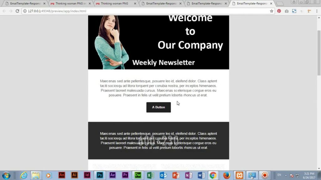
- Test, test, test: Preview your email template in various email clients and devices to ensure that it displays correctly and functions as intended. Dreamweaver’s live preview feature can help streamline the testing process.
Step 4: Implementing Responsive Design Techniques Responsive email design relies on CSS media queries to adjust the layout and styling of email templates based on the viewport size of the recipient’s device. Follow these steps to implement responsive design techniques in your email template:
- Define breakpoints: Identify key viewport sizes at which your email layout should adapt, such as desktop, tablet, and smartphone.
- Use media queries: Write CSS media queries to target specific viewport ranges and apply corresponding styles to adjust the layout, font sizes, and image dimensions accordingly.
- Fluid layouts: Design your email template with fluid widths and flexible elements that scale proportionally to fit the available screen space, ensuring a consistent user experience across devices.
- Test responsiveness: Test your responsive email template across different devices and screen sizes to verify that it adapts correctly and maintains readability and usability.
Step 5: Finalizing and Testing Your Email Template Before deploying your email template in a real-world campaign, it’s essential to conduct thorough testing to ensure compatibility and functionality across various email clients and devices. Follow these steps to finalize and test your email template in Dreamweaver:
- Validate your HTML and CSS code: Use Dreamweaver’s built-in code validation tools or online validators to check for syntax errors and ensure compliance with web standards.
- Test rendering: Preview your email template in popular email clients, such as Gmail, Outlook, and Apple Mail, to verify rendering consistency and compatibility.
- Send test emails: Send test emails to yourself and colleagues using different email clients and devices to evaluate how the template appears and behaves in real-world conditions.
- Iterate and refine: Review feedback from testing and make any necessary adjustments to improve the design, layout, and performance of your email template.
Conclusion: Creating responsive email templates in Adobe Dreamweaver is a multifaceted process that requires careful planning, design, and testing. By following the steps outlined in this guide and leveraging Dreamweaver’s powerful features, you can craft visually stunning and functional email templates that engage your audience across devices. Whether you’re a seasoned email marketer or new to responsive design, mastering the art of email template creation in Dreamweaver opens up endless possibilities for delivering compelling and impactful email campaigns.