The Art and Science of Choosing Colors in CorelDRAW: A Comprehensive Guide to Elevating Your Design Palette
Introduction: In the realm of digital design, the selection of colors is a nuanced and critical aspect that can significantly impact the success of a visual composition. CorelDRAW, a leading vector graphics editor, places a wealth of color choices and tools at the fingertips of designers. In this extensive guide, we embark on a journey to explore the art and science of choosing colors in CorelDRAW, unraveling the complexities, discussing practical methodologies, and uncovering the creative potential that lies within the realm of color selection.
I. The Fundamentals of Color Theory: Before delving into the specifics of choosing colors in CorelDRAW, it is essential to grasp the foundational principles of color theory. Understanding concepts such as the color wheel, color harmonies, and the emotional impact of colors lays the groundwork for informed and intentional color choices.
A. The Color Wheel:
- Primary, Secondary, and Tertiary Colors: CorelDRAW incorporates the traditional color wheel, highlighting primary colors (red, blue, yellow), secondary colors (green, orange, purple), and tertiary colors (the combinations of primary and secondary colors).
- Complementary Colors: Designers often leverage complementary colors from opposite sides of the wheel to create visually striking and vibrant compositions.
B. Color Harmonies:
- Analogous, Triadic, and Split-Complementary Schemes: CorelDRAW provides tools to explore various color harmonies. Designers can experiment with analogous schemes for a cohesive look, triadic schemes for balance, and split-complementary schemes for a nuanced approach.
C. Emotional Impact:
- Psychological Associations: Colors evoke emotions and convey messages. Understanding the psychological associations of colors is crucial for designers aiming to communicate specific moods or themes through their work.
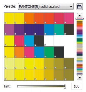
II. CorelDRAW’s Color Tools and Palettes: CorelDRAW offers a robust set of tools and palettes dedicated to color selection. Navigating these features empowers designers to translate color theory into tangible and visually impactful design choices.
A. Color Styles:
- Streamlining Consistency: Color Styles in CorelDRAW allow designers to create and manage consistent color schemes across their projects. Any changes made to a Color Style are automatically reflected throughout the entire design, ensuring coherence and efficiency.
B. Color Harmonies Palette:
- Real-Time Exploration: The Color Harmonies palette in CorelDRAW enables designers to explore and experiment with different color harmonies interactively. This dynamic tool provides immediate visual feedback, facilitating the discovery of harmonious color combinations.
C. Color Wheel:
- Intuitive Navigation: CorelDRAW’s Color Wheel feature allows for intuitive navigation through color choices. Designers can effortlessly select and adjust colors within the context of the color wheel, fostering a seamless and visual approach to color selection.
III. Practical Strategies for Color Selection: While understanding color theory and utilizing CorelDRAW’s tools is crucial, practical strategies for selecting colors in specific design contexts enhance the effectiveness of color choices.
A. Branding and Corporate Identity:
- Consistency and Recognition: CorelDRAW becomes an invaluable ally in establishing and maintaining consistent color palettes for branding. Designers can use the software to create and manage brand-specific colors that reinforce identity across various materials.
B. Web and Digital Design:
- RGB Spectrum: For web and digital design, where colors are displayed on screens, the RGB color model takes center stage. CorelDRAW provides seamless integration with this model, allowing designers to craft vibrant and visually appealing digital assets.
C. Print Design:
- CMYK Precision: When designing for print, CorelDRAW’s compatibility with the CMYK color model ensures accurate representation of colors in the final printed output. Designers can rely on the software to manage color separations and achieve optimal print quality.
IV. Advanced Techniques for Color Exploration: To truly master the art of choosing colors in CorelDRAW, designers can explore advanced techniques that go beyond the basics, pushing the boundaries of creativity and expression.
A. Photo Color Matching:
- Seamless Integration: CorelDRAW’s photo color matching feature enables designers to seamlessly integrate colors from photos into their designs. This tool ensures a harmonious blend between digital artwork and real-world color inspirations.
B. Color Styles Docker:
- Efficient Workflow: The Color Styles Docker in CorelDRAW serves as a centralized hub for managing color styles, streamlining the design process. Designers can efficiently organize, edit, and apply color styles, enhancing overall workflow efficiency.
V. Challenges and Solutions: Even with the wealth of tools and features in CorelDRAW, designers may encounter challenges in the color selection process. Identifying these challenges and implementing strategic solutions is key to overcoming obstacles and achieving desired results.
A. Color Consistency Across Platforms:
- RGB to CMYK Transition: Designers working on projects intended for both digital and print platforms may face challenges in maintaining color consistency. CorelDRAW’s color management tools provide solutions for smooth transitions between RGB and CMYK color spaces.
B. Accessibility and Color Contrast:
- Universal Design Principles: Ensuring color choices consider accessibility is crucial. CorelDRAW’s real-time color contrast analysis tools aid designers in creating designs that are visually accessible to diverse audiences.
VI. Conclusion: In the intricate dance of pixels and vectors, the choices made in selecting colors are the brushstrokes that shape the visual narrative of a design. CorelDRAW, with its array of color tools, palettes, and features, stands as a powerful companion for designers navigating the expansive realm of color selection. By combining the principles of color theory with the practical capabilities of CorelDRAW, designers can unleash their creative potential, crafting visuals that not only please the eye but also communicate messages, evoke emotions, and leave a lasting impact on their audiences. The art and science of choosing colors in CorelDRAW are not mere technicalities; they are the essence of visual storytelling and creative expression in the digital age.