Mastering Color Harmony Creation in CorelDRAW: A Comprehensive Guide to Crafting Harmonious Color Schemes for Design Excellence
Introduction:
In the realm of graphic design, color harmony serves as a cornerstone, elevating compositions from mere arrangements of elements to cohesive, visually appealing works of art. CorelDRAW, renowned for its robust suite of design tools, empowers users to explore the nuances of color theory and create harmonious color schemes with precision and finesse. In this extensive guide, we embark on a journey to unravel the intricacies of creating color harmony in CorelDRAW, equipping designers with the knowledge and techniques to infuse their creations with vibrancy, balance, and visual impact.
Understanding Color Harmony:
Before delving into the practical aspects of color harmony creation, it’s essential to grasp the fundamental principles that underpin this concept. Color harmony refers to the artful arrangement of colors within a composition to achieve a pleasing and balanced visual effect. By selecting colors that complement, contrast, or resonate with one another, designers can evoke specific emotions, convey messages, and enhance overall readability and impact.
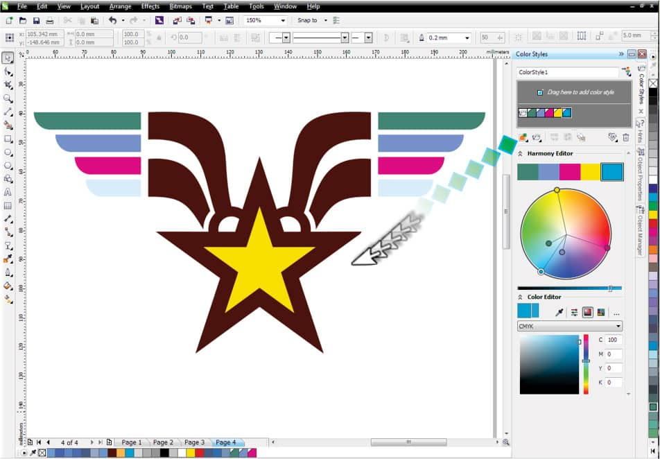
Navigating CorelDRAW’s Color Tools:
CorelDRAW offers a comprehensive suite of tools dedicated to color management and manipulation, providing designers with unparalleled flexibility and control over their color palettes. Let’s explore the key components of CorelDRAW’s color interface:
- Color Palette Docker: The Color Palette Docker serves as the central hub for managing color palettes in CorelDRAW. Here, designers can access a range of preset palettes or create custom color schemes tailored to their specific needs.
- Color Harmonies Docker: The Color Harmonies Docker provides a dedicated workspace for exploring and creating harmonious color schemes. Designers can select from a variety of preset harmonies or experiment with custom arrangements to achieve their desired aesthetic effect.
- Color Picker Tool: The Color Picker Tool allows designers to sample colors from existing elements within their composition or from external sources, enabling precise color matching and coordination.
Creating Color Harmony in CorelDRAW:
With a foundational understanding of color theory and familiarity with CorelDRAW’s color tools, let’s delve into the process of creating harmonious color schemes:
- Selecting a Base Color: Begin by selecting a base color that will serve as the foundation for your color harmony. This could be a dominant color from your design’s branding or a hue that evokes the desired mood or emotion.
- Exploring Harmonious Color Relationships: Utilize the Color Harmonies Docker to explore different harmonious color relationships based on your chosen base color. CorelDRAW offers presets for common harmony types such as complementary, analogous, triadic, and more.
- Experimenting with Color Variations: Once you’ve selected a harmonious color scheme, experiment with variations in hue, saturation, brightness, and contrast to fine-tune the overall composition. CorelDRAW provides intuitive controls for adjusting these parameters, allowing for precise color adjustments.
- Evaluating Visual Cohesion: As you refine your color scheme, continually evaluate the visual cohesion and balance of the composition. Ensure that the colors work harmoniously together and contribute to the overall aesthetic appeal of the design.
- Incorporating Accent Colors: Consider incorporating accent colors to add visual interest and depth to your composition. Accent colors can be used sparingly to highlight key elements or create focal points within the design.
Advanced Techniques for Color Harmony Creation:
Beyond the basics of color harmony creation, CorelDRAW offers a range of advanced techniques and features to enhance your design process:
- Interactive Color Harmonies: CorelDRAW’s interactive color harmony tools allow designers to dynamically adjust color relationships in real-time, facilitating rapid experimentation and exploration. By dragging color handles within the Color Harmonies Docker, designers can instantly visualize how changes affect the overall composition.
- Color Styles and Swatch Libraries: Utilize CorelDRAW’s color styles and swatch libraries to create reusable color palettes that can be applied consistently across multiple projects. By saving color schemes as styles or libraries, designers can streamline their workflow and maintain visual consistency.
- Exporting and Sharing Color Schemes: To promote collaboration and consistency across projects, CorelDRAW enables designers to export and share color schemes with colleagues or clients. By saving color schemes as swatch libraries or XML files, designers can seamlessly transfer color palettes between documents or share them with external collaborators.
Conclusion:
In the dynamic landscape of graphic design, mastery of color harmony creation is essential for achieving design excellence. By leveraging the powerful tools and features of CorelDRAW, designers can explore the nuances of color theory and craft harmonious color schemes that captivate, inspire, and resonate with audiences.
From bold and vibrant palettes to subtle and sophisticated arrangements, the possibilities for creative expression are limitless. By embracing the principles and techniques outlined in this guide, designers can embark on a journey of color exploration and innovation, forging designs that transcend the ordinary and leave a lasting impression in the hearts and minds of viewers. Let your creativity soar as you explore the endless horizons of color harmony creation in CorelDRAW, and watch as your designs come to life with vibrancy, balance, and visual impact.