Exploring Advanced Color Harmony Techniques in CorelDRAW: A Comprehensive Guide to Applying Rules to Color Harmonies for Design Mastery
In the vibrant world of graphic design, color harmony stands as a fundamental principle, guiding designers in the creation of visually appealing compositions. Within the arsenal of design software, CorelDRAW emerges as a powerhouse, offering a robust suite of tools to manipulate and refine color harmonies with precision. Among its advanced features lies the ability to apply rules to color harmonies, empowering designers to achieve nuanced and sophisticated color relationships. In this exhaustive guide, we embark on a journey to unravel the intricacies of applying rules to color harmonies in CorelDRAW, equipping designers with the knowledge to elevate their creations to new heights of aesthetic excellence.
Understanding the Essence of Color Harmony
Before delving into the application of rules, it’s imperative to grasp the essence of color harmony and its significance in design. Color harmony refers to the artful arrangement of colors within a composition to create a visually pleasing and balanced effect. By selecting colors that complement, contrast, or resonate with one another, designers can evoke specific emotions, convey messages, and enhance overall readability and impact.
The Role of Rules in Color Harmony
In the realm of color theory, rules serve as guidelines or principles that dictate the relationship between colors within a harmonious scheme. These rules govern factors such as color contrast, temperature, and saturation, providing designers with a framework to create cohesive and engaging designs. By applying rules to color harmonies, designers can manipulate color relationships in subtle yet impactful ways, resulting in compositions that resonate with viewers on a visceral level.
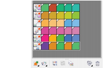
Navigating the Color Harmony Tools in CorelDRAW
CorelDRAW offers a comprehensive suite of tools dedicated to color harmony, providing designers with unparalleled flexibility and control over their color palettes. Let’s explore the key components of the color harmony interface:
1. Color Harmonies Docker:
The Color Harmonies Docker serves as the command center for manipulating color harmonies in CorelDRAW. Here, designers can access a range of preset harmonies or create custom schemes tailored to their specific needs.
2. Preset Harmonies:
CorelDRAW offers a selection of predefined color harmonies, including complementary, analogous, triadic, and more. Designers can select from these presets as a starting point for their compositions or use them for inspiration and reference.
3. Custom Harmonies:
For greater creative control, designers can create custom color harmonies tailored to their design objectives. By adjusting parameters such as hue, saturation, and brightness, designers can fine-tune their color schemes to achieve the desired aesthetic effect.
Applying Rules to Color Harmonies
Now that we’ve familiarized ourselves with the color harmony interface in CorelDRAW, let’s delve into the process of applying rules to color harmonies:
1. Selecting a Color Harmony:
Begin by selecting the desired color harmony from the Color Harmonies Docker. Whether opting for a preset scheme or creating a custom harmony, ensure that the chosen palette aligns with your design goals and objectives.
2. Accessing the Rule Options:
Once a color harmony is selected, navigate to the Rule Options within the Color Harmonies Docker. Here, designers can explore a range of rules governing color relationships, including complementary, split complementary, triadic, tetradic, and more.
3. Experimenting with Rule Variations:
CorelDRAW offers a variety of rule variations within each category, allowing designers to experiment with different configurations and effects. By toggling between rule options, designers can preview how various rules impact the overall composition and adjust accordingly.
4. Fine-Tuning Color Properties:
In addition to applying rules, designers can further refine their color harmonies by adjusting individual color properties. CorelDRAW provides intuitive controls for modifying hue, saturation, brightness, and transparency, enabling designers to achieve precise color adjustments with ease.
Leveraging Advanced Techniques for Design Excellence
Beyond the basics of applying rules to color harmonies, CorelDRAW offers a range of advanced techniques to elevate your designs to new heights of excellence:
1. Interactive Color Harmonies:
CorelDRAW’s interactive color harmony tools allow designers to dynamically adjust color relationships in real-time, facilitating rapid experimentation and exploration. By dragging color handles within the Color Harmonies Docker, designers can instantly visualize how changes affect the overall composition.
2. Harmony Rules Presets:
To streamline the design process, CorelDRAW provides a selection of harmony rules presets tailored to specific design scenarios. Whether designing for print, web, or multimedia, designers can leverage these presets as a starting point for their projects, saving time and effort while ensuring visual coherence.
3. Exporting and Sharing Color Harmonies:
To promote collaboration and consistency across projects, CorelDRAW enables designers to export and share color harmonies with colleagues or clients. By saving color harmonies as swatch libraries or XML files, designers can seamlessly transfer color schemes between documents or share them with external collaborators.
Embracing the Power of Color Harmony in Design
In the ever-evolving landscape of graphic design, mastery of color harmony techniques is indispensable for achieving design excellence. By harnessing the capabilities of CorelDRAW’s color harmony tools and applying rules to color schemes with precision and finesse, designers can create compositions that captivate, inspire, and resonate with audiences.
From bold and vibrant palettes to subtle and harmonious arrangements, the possibilities for creative expression are boundless. By embracing the principles and techniques outlined in this guide, designers can embark on a journey of color exploration and innovation, forging designs that transcend the ordinary and leave a lasting impression in the hearts and minds of viewers.
Conclusion
In the tapestry of design, color harmony serves as a guiding light, illuminating the path to visual coherence and aesthetic excellence. With CorelDRAW’s advanced color harmony tools and the ability to apply rules to color schemes, designers possess the means to orchestrate harmonious compositions that captivate the senses and stir the soul.
By embracing the principles of color theory and leveraging the power of CorelDRAW’s intuitive interface, designers can unlock a world of creative possibilities, breathing life into their visions and bringing them to fruition with unparalleled clarity and impact. Let your creativity soar as you explore the endless horizons of color harmony in CorelDRAW, and watch as your designs transcend the ordinary to become timeless works of art.