The Best Photoshop Settings for Designing Accessible Web Graphics for Color-Blind Users
The Best Photoshop Settings for Designing Accessible Web Graphics for Color-Blind Users
When it comes to designing graphics for the web, it is not enough to just make things appear visually beautiful; other considerations include ensuring that everyone can comprehend and make use of what you have created. It is estimated that a sizeable proportion of the world’s population suffers from some kind of color vision deficit, which indicates that they have a distinct perception of colors in comparison to the typical viewer. If your designs depend significantly on color alone to express information, then it is possible that many consumers may have difficulty understanding the material you have created. Now more than ever, accessibility is not a feature that can be chosen at will; rather, it is an essential component of professional design practice. Photoshop comes equipped with a number of tools and options that enable designers to produce graphics that are legible, clear, and accessible for color-blind users without compromising the quality of the visuals.
In the realm of digital design, an understanding of color blindness
There is not a single disease that is known as color blindness; rather, it is a variety of visual abnormalities that influence how individuals see color. Among the most frequent forms, red-green deficits, which include deuteranopia and protanopia, are the most prevalent, followed by blue-yellow deficiencies, which include tritanopia. Those who are affected by these diseases do not experience a black-and-white vision; rather, they have a level of difficulty or inability to differentiate between certain color combinations. In the field of digital design, this often results in issues associated with charts, buttons, warnings, and other aspects of the interface that are dependent on minor color changes. Designers are able to avoid making assumptions about how their work will be regarded when they have a thorough understanding of these variables.
Understanding Why Accessibility Is Crucial in Web Graphics
The concept of accessible design encompasses not only the concept of usability, performance, and professionalism, but also the concept of inclusion. Regardless of how stunning the design may be, your message will be unsuccessful if people are unable to readily comprehend the graphics you provide them. There is a correlation between poor accessibility and increased bounce rates, less engagement, and lost conversions. Accessible design broadens your audience and increases the level of pleasure experienced by users, which is beneficial to your company. When it comes to legal and ethical considerations, a number of nations have begun mandating that digital items adhere to universal accessibility requirements. The practice of designing with accessibility in mind is no longer a choice; rather, it is an integral element of the responsibilities of contemporary design.
The Process of Creating an Accessible Workspace for Photoshop Software
In order to begin, you will need to configure Photoshop so that it can enable accessible design processes. When working with online graphics, it is advised that designers work in the RGB color mode; however, they must also pay attention to the brightness, contrast, and color separation levels. Ensuring that your workspace is properly calibrated guarantees that the information that you see on your screen is accurate to a reasonable degree. Maintaining visual clarity may be accomplished by the use of constant zoom levels, grid systems, and alignment tools. When designing layouts that need to be readily understood by all users, it is necessary to promote organized design, which may be encouraged by maintaining a clean workstation.
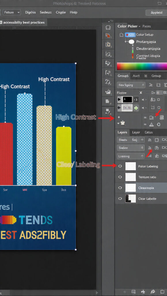
In order to simulate color blindness, proof colors are provided.
Proof Colours is a valuable function that is included in Photoshop. It gives you the ability to simulate how your design would seem to people that have various forms of color blindness from diverse backgrounds. You are able to see your design from a variety of angles by activating View > Proof Setup and choosing a number of different color vision impairments. This highlights problematic regions in which colors start to blur together or lose their significance. During the simulation process, designers often find that features that they had previously believed to be clearly unique and distinct really become practically similar. When it comes to discovering accessibility concerns before your visuals are made public, this tool is really necessary.
It is important to choose color palettes that are easily distinguishable.
Instead than focusing only on aesthetics, accessible color palettes are constructed around contrast. It is necessary for colors to vary in both hue and brightness in order for color-blind people to be able to differentiate between them. As an example, a person who suffers from red-green deficiency could seem to have the same appearance as red and green, although red and blue are often simpler to distinguish from one another. For the purpose of checking that there are adequate luminance differences, Photoshop gives you the ability to test color values quantitatively using the Color Picker. When designing with accessible palettes, it is not necessary to use bland colors; rather, it is appropriate to make use of intelligent color connections that maintain meaning regardless of the visual settings.
Keeping Color from Being the Only Metric to Consider
When it comes to accessibility, one of the most frequent errors that people make is depending only on color to communicate information. For instance, users who are color-blind would have difficulties if the sole color used for error messages is red, while green is used for success messages. Designers should instead blend color with text labels, icons, forms, or patterns in order to create cohesive designs. When working with Photoshop, it is simple to add layers of symbols, outlines, or textures on top of items that are dependent on color. Consequently, this guarantees that meaning is conveyed across a variety of visual pathways, not simply through the sense of color.
Creating Designs That Have High Contrast Ratios
When it comes to accessibility, contrast is one of the most crucial variables and features. Text and icons need to be able to be easily distinguished from their respective backgrounds. Despite the fact that combinations with low contrast may have an exquisite appearance, they often become illegible for users who have difficulty seeing. Through the use of the Info panel, Photoshop gives designers the ability to accurately modify brightness settings and get accurate measurements. When the contrast ratio is high, it guarantees that the material can be read clearly regardless of the lighting circumstances, screen kinds, or visual ability of the user.
Clarity testing with the use of grayscale previews
You may examine your design in grayscale, which is an approach that is both easy and powerful. By doing so, color is completely removed, and it becomes clear whether or not the structure is still logical. When two items become indistinguishable in grayscale, it is probable that color-blind users will have difficulty distinguishing between them. You have the ability to temporarily desaturate your view in Photoshop, and you can also utilize adjustment layers to explore grayscale versions. Instead of focusing on cosmetic color selections, this strategy compels you to concentrate on the organization, hierarchy, and contrast of the design.
Implementing Differentiation Through the Use of Patterns and Textures
Due to the fact that they provide visual diversity beyond color, patterns and textures are effective tools for accessibility. When it comes to charts, maps, and infographics, the use of stripes, dots, or varied textures assists viewers in identifying portions, even when colors may mix together. It is simple to put this strategy into action thanks to the fact that Photoshop provides tools for creating unique patterns and layer styles. Considering that it is capable of supporting both aesthetic and practical design, this method is frequently used in the field of professional data visualization.
Increasing Visibility Through the Use of Layer Styles and Strokes
A large improvement in visibility may be achieved by using strokes, outlines, and shadows. An example of this would be applying a thin black stroke around light-colored text in order to maintain legibility on backgrounds that are complicated. Thanks to Photoshop’s Layer Styles, designers are able to apply these effects in a way that is not damaging. By doing so, visual distinction between items is achieved without depending only on variations in color. Outlines are particularly helpful for design elements like as buttons, icons, and other interface components that need to be easily discernible even when reduced in size.
Examining User Interface Elements and Icons at Smaller Sizes
It is common for accessibility problems to grow more severe at smaller sizes. When decreased in size, icons and other parts of the user interface that seem obvious when seen at larger sizes may become unclear. Photoshop gives you the ability to preview creations at a variety of resolutions and export them in a variety of sizes. Putting your graphics through their paces at display sizes that are more accurate helps you locate spots where forms blend together or features vanish. It is especially crucial to keep this in mind when designing for mobile devices, as the screen size and viewing distance might vary greatly.
Analysis via the use of color value overlays
It is common practice for advanced designers to perform color value analysis numerically rather than visually. The RGB values of any pixel are displayed in the Info panel of Photoshop. You will be able to ensure that there is sufficient separation in terms of brightness and contrast if you compare these values. Two colors may appear to be different from one another, but if their luminance values are comparable, it is likely that many users will perceive them as being the same. Designing with numerical awareness brings an additional level of technical precision to the work that is done on accessibility.
Establishing Design Systems That Are Accessible
The creation of accessible design systems is something that professional teams do rather than addressing accessibility issues one design at a time. It is necessary to define color rules, contrast standards, typography guidelines, and icon styles in order to accomplish this. Through the use of reusable templates and style guides, Photoshop can be utilized to construct and document these systems respectively. This decreases the likelihood of accessibility regressions occurring and assures that all future designs are consistent with one another.
The Reasons Why Accessibility Improves the Quality of Design Overall
It is not the case that accessible design restricts creativity; rather, it improves clarity. In most cases, designs that are successful for color-blind users are also successful for everyone else. In addition to being simpler to scan, they are also quicker to comprehend and more visually structured. Design professionals are compelled to focus on communication rather than decoration when designing for accessibility. Because of this, the visual hierarchy is strengthened, the usability is improved, and the messaging is more influential.
In the realm of professional design, accessibility is a skill.
It is now essential for digital designers to have a fundamental understanding of accessibility. There is a growing expectation among customers and employers that designers will create products that are inclusive by default. Despite the fact that Photoshop offers all of the necessary technical tools, accessibility is ultimately determined by design thinking rather than by the features of the software. Designers who are able to master accessible workflows not only offer themselves a competitive advantage but also contribute to a digital world that is more inclusive.
Giving Priority to Humans, Not Just Screens in Design
Accessible design is based on the principle of respecting the diversity of the human population. The fact that individuals have varying experiences with visuals is something that good design takes into account. You are not creating a unique version of your work when you design for color-blind users; rather, you are creating a version of your work that is superior to the conventional version. Not only does Photoshop become a tool for creativity, but it also serves as a bridge between aesthetics and design that is centered on the user.