Unveiling the Art of Customizing Your YouTube Channel Layout: A Comprehensive Guide to Crafting a Captivating Visual Experience
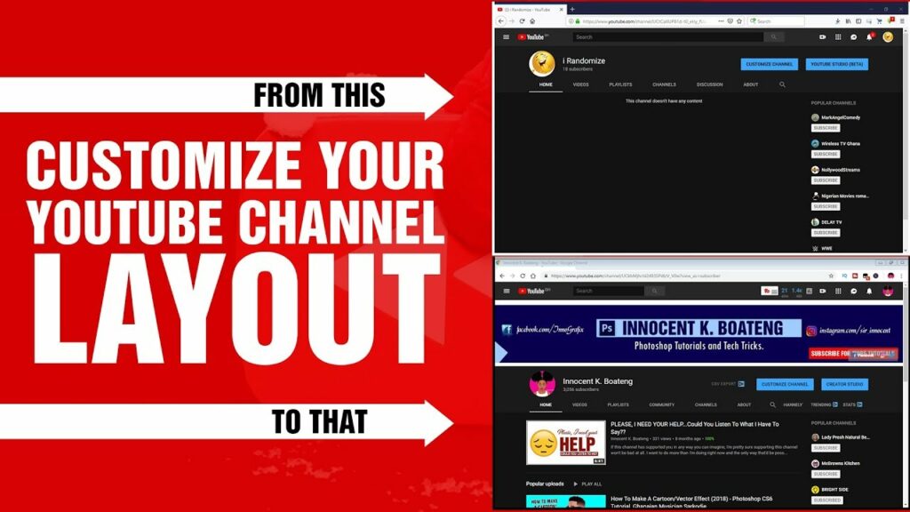
In the ever-evolving world of online video content, YouTube stands tall as the ultimate destination for creators to share their stories, entertain audiences, and build thriving communities. With millions of channels covering every imaginable topic, standing out from the crowd has become increasingly challenging. One powerful way to differentiate your channel and leave a lasting impression on viewers is through the customization of your channel layout.
In this extensive guide, we will embark on a journey through the intricacies of customizing your YouTube channel layout, exploring everything from layout options and design considerations to optimization techniques and creative inspiration. Whether you’re a seasoned content creator seeking to revamp your channel’s look or a newcomer eager to make a splash, this guide will equip you with the knowledge and tools needed to craft a visually compelling and user-friendly channel layout that captivates your audience.
Understanding the Importance of Your YouTube Channel Layout
Your channel layout serves as the digital storefront of your brand on YouTube, offering visitors their first glimpse into your content universe. A well-crafted layout not only enhances the visual appeal of your channel but also facilitates navigation, encourages engagement, and reinforces your brand identity. Here are some key reasons why customizing your channel layout is crucial:
- Brand Identity: Your channel layout provides an opportunity to showcase your brand identity, including your logo, color scheme, and visual style. Consistent branding across your channel reinforces brand recognition and fosters a sense of trust and familiarity among your audience.
- User Experience: A well-designed layout makes it easier for viewers to navigate your channel, discover content, and engage with your brand. Intuitive navigation and clear organization enhance the overall user experience, encouraging visitors to spend more time exploring your channel.
- Content Highlighting: Customizing your layout allows you to showcase your best-performing content, promote new uploads, and feature curated playlists. Strategic content highlighting helps guide viewers to the content that resonates with their interests, increasing watch time and engagement.
- Differentiation: With millions of channels vying for attention, customizing your layout is a powerful way to differentiate yourself from the competition. By infusing your layout with unique design elements and personalized touches, you can create a distinctive brand identity that sets your channel apart.
Exploring Layout Options and Customization Features
YouTube offers a range of layout options and customization features that allow you to tailor your channel to suit your brand and content. From channel banners and thumbnails to sections and playlists, here’s a closer look at some of the key elements you can customize:
1. Channel Banner and Profile Picture
Your channel banner and profile picture are the visual focal points of your channel layout, instantly conveying your brand identity to visitors. When customizing your banner and profile picture, consider the following:
- Channel Banner: Create a visually appealing banner that reflects your brand identity and content themes. Incorporate high-quality imagery, typography, and branding elements to make a memorable impression.
- Profile Picture: Choose a clear and recognizable profile picture, such as your channel logo or a professional headshot. Ensure that your profile picture is optimized for visibility across different devices.
2. Channel Sections
Channel sections allow you to organize your content into easily accessible categories, making it simpler for viewers to find what they’re looking for. When customizing your channel sections, keep the following tips in mind:
- Organize by Theme: Group your videos into thematic sections based on topics, series, or genres. This helps viewers navigate your channel more efficiently and discover content that interests them.
- Feature Key Content: Use featured sections to highlight your best-performing videos, latest uploads, or curated playlists. Feature sections appear prominently on your channel homepage, drawing viewers’ attention to your most important content.
- Customize Layout: Experiment with different layout options, such as horizontal rows or vertical lists, to find the most visually appealing and user-friendly arrangement for your channel sections.
3. Playlists and Videos
Playlists are an excellent way to organize your videos into cohesive collections and guide viewers through a curated viewing experience. When customizing your playlists and individual videos, consider the following:
- Curate Playlists: Create playlists around specific themes, topics, or series to provide viewers with a curated viewing experience. Add descriptive titles, thumbnails, and descriptions to make your playlists more engaging and informative.
- Optimize Thumbnails: Design eye-catching thumbnails that entice viewers to click and watch your videos. Use high-quality imagery, bold typography, and compelling visuals to make your thumbnails stand out in search results and on your channel homepage.
- Add Descriptions and Tags: Write descriptive titles, tags, and descriptions for your videos and playlists to improve their discoverability in search results. Use relevant keywords and phrases to help viewers find your content more easily.
Best Practices and Optimization Techniques
Now that we’ve explored the key elements of customizing your YouTube channel layout let’s delve into some best practices and optimization techniques to help you maximize the impact of your customization efforts:
- Keep It Consistent: Maintain a consistent visual style and branding across all elements of your channel layout, including your banner, thumbnails, and channel sections. Consistency reinforces brand identity and fosters recognition among your audience.
- Prioritize Accessibility: Ensure that your channel layout is accessible and user-friendly across different devices and screen sizes. Test your layout on desktop, mobile, and tablet devices to ensure optimal viewing experiences for all users.
- Update Regularly: Regularly update your channel layout to reflect changes in your content, branding, or promotions. Keeping your layout fresh and up-to-date shows that your channel is active and engaged, encouraging viewers to return for more.
- Analyze Performance: Use YouTube Analytics to track the performance of your channel layout and content. Monitor metrics such as watch time, engagement, and subscriber growth to identify areas for improvement and optimization.
- Engage with Your Audience: Solicit feedback from your audience on your channel layout and content organization. Encourage viewers to leave comments, likes, and suggestions to help you tailor your layout to better meet their needs and preferences.
Creative Inspiration and Examples
Looking for inspiration to kickstart your channel customization journey? Here are some creative examples of well-designed YouTube channel layouts to inspire you:
- Casey Neistat: The popular vlogger Casey Neistat’s channel features a clean and minimalist layout with bold typography and striking imagery. His channel banner prominently features his logo and signature sunglasses, instantly recognizable to his millions of subscribers.
- TED: The TED Talks channel employs a dynamic and visually engaging layout that showcases a diverse range of topics and speakers. Their channel sections are organized by themes such as “Technology,” “Science,” and “Inspiration,” making it easy for viewers to explore content based on their interests.
- GamingWithJen: The gaming channel GamingWithJen uses vibrant colors and playful graphics to create an inviting and immersive layout. Their channel sections highlight popular series such as “Minecraft” and “Roblox,” with custom thumbnails and descriptions that entice viewers to dive into the gameplay.
- National Geographic: The National Geographic channel’s layout exudes sophistication and elegance, with stunning photography and compelling storytelling. Their channel sections feature curated playlists on topics such as “Wildlife,” “Science,” and “Exploration,” offering viewers a window into the wonders of the natural world.
Conclusion
Customizing your YouTube channel layout is a powerful way to enhance your brand identity, improve user experience, and stand out in a crowded digital landscape. By carefully crafting your channel banner, organizing your content into cohesive sections, and optimizing your playlists and videos, you can create a visually compelling and user-friendly channel layout that captivates your audience and keeps them coming back for more.
Remember to stay true to your brand identity, experiment with different layout options, and regularly update your channel to keep it fresh and engaging. With creativity, strategic thinking, and a keen eye for design, you can create a channel layout that reflects your unique style and resonates with your audience, fostering deeper connections and driving long-term success on YouTube.
So, what are you waiting for? Roll up your sleeves, unleash your creativity, and embark on a journey to transform your YouTube channel into a captivating digital destination that leaves a lasting impression on viewers around the world. Happy customizing!
