How to Prepare Photoshop Artboards for High-Resolution DTF (Direct to Film) Shirt Printing
How to Prepare Photoshop Artboards for High-Resolution DTF (Direct to Film) Shirt Printing
The DTF printing technique is a specialized approach that involves the use of adhesive powder, heat, and a transfer film in order to facilitate the transfer of your design onto a garment. In contrast to Direct-to-Garment (DTG) printing or screen printing, this method involves the addition of an intermediary layer between the ink and the fabric. This layer alters the appearance of your design when it is printed in its final form. Without appropriate preparation, files that were developed for digital displays or conventional prints sometimes do not convert effectively to DTF. This is because of the circumstances described above. By ensuring that your Photoshop artboards are properly prepared, you can guarantee that your designs will have their crisp edges, vivid colors, and clear details even after going through the complicated process of transfer. For the purpose of generating professional-quality clothing that satisfies the requirements of the customer, it is vital to have a solid understanding of how DTF operates and how to alter your files properly.
Acquiring Knowledge of the Effects That DTF Printing Has on Your File
Before being heat-pressed into the fabric, DTF prints are first generated on a specialized film. After that, the film is painted with adhesive powder and then applied to the cloth. Additionally, the appearance of colors, gradients, and tiny details is influenced by this intermediary stage. DTF printing, in contrast to printing directly onto fabric, necessitates that designers take into consideration the interplay between the ink, adhesive, and the texture of the garment. If the file is not correctly prepared, the colors may move somewhat, the gradients may become less distinct, and the sharpness of the tiny details or small writing may be lost. In order to take into consideration how the inks react when subjected to heat and pressure, designers are need to approach their Photoshop files as print-specific assets rather as digital graphics from the beginning. When you are aware of these physical constraints and plan your design with them in mind, you may lessen the number of surprises that occur and guarantee that the finished result will appear exactly as you had envisioned it.
What Causes Differing Colors to Appear in DTF Printing
Designers often see color changes in DTF, which is one of the most prevalent issues they confront. As a result of the combination of adhesive powder and the transfer process, bright colors like blues, reds, and greens often look darker or less brilliant than they really are. It is possible that after printing, gradients that look smooth on the screen may appear banded or muted. When designers produce files only in RGB without taking into consideration the possibility of actual printing, they often encounter unexpected outcomes. Additional issues arise when darker materials are used since the white underbase layer has the potential to influence how colors are perceived. Prints have the potential to seem muddy, faded, or uneven if color management is not carefully managed. By gaining an understanding of these aspects, you will be able to make adjustments to your Photoshop files in advance and produce outcomes that are predictable.
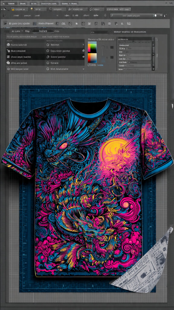
Positioning the Artboard in the Appropriate Dimensions and Resolution
In order to properly prepare a DTF file, the first step in the technical process is to determine the appropriate artboard size and resolution. It is important that the proportions of your Photoshop canvas are identical to those of the final print. After you have finished your artwork, if you scale a tiny design to suit a bigger garment, you will end up with blurred edges, a lack of detail, and poor color transitions. The printer is able to produce gradients, textures, and minuscule fonts with more precision when it is provided with high-resolution data. It is suggested that a minimum of 300 dots per inch (DPI) be used for DTF when printing at the actual print size. An illustration that is intended to be printed at a size of twelve by sixteen inches, for instance, must have an artboard that is also twelve by sixteen inches from the very beginning stage. This guarantees that every detail, from lines that are extremely fine to gradients that are very subtle, is clear and readable on the garment that is finished.
Tips for Selecting the Appropriate Color Mode for DTF
Managing colors is an essential part of the DTF printing process. DTF inks reproduce colors in a manner that is more similar to CMYK, since RGB gives a broader gamut and more bright display colors. However, designers often work with RGB because it offers these benefits. It is possible that bright tones may seem darker, more subdued, or less saturated on the clothing as a result of this variation. Using a methodology that incorporates creating in RGB while also making use of soft proofing or a CMYK preview to predict how your colors will convert produces the most productive workflow. An realistic representation of the color palette you wish to use may be maintained by the manual adjustment of brightness, contrast, and saturation. Additionally, this phase assists in avoiding typical errors, such as shadows that are too dark or highlights that are washed out, both of which have the potential to diminish the overall visual impact of your design.
Simulation of DTF output by the use of soft proofing
When it comes to developing DTF designs, one of the most crucial tools is the soft proofing option that is available in Photoshop. With the “Proof Colors” feature turned on, you will be able to get a more accurate representation of how your colors and tones will look when they are printed on film and fabric. Before exporting, this simulation enables exact modifications to be made to the contrast, brightness, and saturation characteristics of the image. Due to the fact that it shows regions that may print differently than planned, soft proofing is especially helpful for complicated designs that include gradients or subtle color transitions. The DTF technique is notorious for producing muddy blends, loss of detail, and color changes; however, designers have the ability to perform targeted modifications to avoid these issues. When time is invested in this phase, the probability of generating a print of professional quality on the very first try is greatly increased.
In the context of film transfers, managing contrast
Due to the fact that the ink is passed through a film and adhesive powder before reaching the garment, DTF printing results in a reduction in the apparent sharpness of the print. It is possible that designs with low contrast or delicate gradients may seem lifeless or flat once they have been copied. In order to make up for this, the midtones should be somewhat brighter, the edges should be better defined, and the essential parts should be clearly differentiated from the backgrounds. Additionally, patterns with a high contrast aid to retain the readability of text and the visibility of small details, especially on clothing that are deeper in color. In many cases, a design that seems “too contrasty” on a computer screen prints flawlessly after transfer. This is because the transfer process counteracts the natural softening effect that is induced by the film and heat procedures. When it comes to maintaining the authenticity of your artwork, careful contrast control is really necessary.
Take precautions to avoid over-saturation and ink overload
When designers are getting ready for DTF printing, one of the most frequent mistakes they make is oversaturating the colors in Photoshop. Excessive saturation may seem to be an effective method for bringing out the vibrancy of colors; nevertheless, it may result in an overdose of ink, which can create problems with blending, the loss of fine detail, and uneven texture. Brightness that is under control and saturation levels that are modest produce prints that are cleaner and more accurate in their depiction of color. In addition, the management of saturation guarantees that gradients will continue to be smooth, edges will continue to be sharp, and the fabric will have its natural feel following transfer. Rather than pushing colors to their limits, you should concentrate on creating balanced tones that are consistent from the screen to the printed page.
Blacks and other dark colors are handled.
When it comes to DTF printing, dark colors, and particularly pure black, bring their own set of issues. When the printer is trying to achieve full RGB black, it often has to put down the maximum amount of ink, which might result in thick spots that conceal texture and tiny features. For the purpose of preserving highlights and maintaining depth without oversaturating the ink, the use of rich dark grays or layered dark tones is recommended. This method assures that the printed pattern will continue to be breathable and visually intriguing while preventing parts on the garment from becoming blotchy or rigid. When working with dark hues, designers should carefully tweak shadow regions and minor gradients in order to produce consistent detail across the color palette. To produce DTF prints of professional quality, it is essential to handle blacks in the appropriate manner.
Having to Deal with Backgrounds That Are Transparent
Backgrounds that are translucent are required for many DTF designs, especially those that include text overlays, pictures, and names. Simply concealing a layer in Photoshop or covering a backdrop with white is not enough to get the desired effect. The document has to have complete transparency, which will guarantee that only the design components that are visible will be printed. In addition to preventing unsightly white rectangles from appearing on the finished garment, transparent backgrounds make it possible for patterns to blend in flawlessly with any shirt color. Additionally, exporting in the proper manner with transparency helps to maintain edges and details, resulting in a finish that is clean and professional. It is very necessary to have effective background management in order to produce high-quality DTF.
The Process of Getting Files Ready for Light and Dark Garments
When going through the DTF process, light and dark clothes react in distinct ways. It is possible for colors to print directly without a white underbase on light clothes; but, in order to achieve visibility, somewhat deeper hues may be required. When printing on dark clothes, a white underbase is applied first. This method not only makes the colors more vibrant, but it also increases the likelihood of muddy merging. When applied to dark materials, patterns that make use of simplified gradients, crisp edges, and strong forms are able to keep their clarity and brightness. In order to get consistent results across a variety of shirt colors, it is essential to have a solid understanding of how color layers interact with the article of clothing. For prints that are dependable, designers need to prepare their files so that they can fit both sorts of garments.
Preparing the File Structure for Cleaning and Organization
It is important that your Photoshop file is well structured and free of any technical errors before you export it. There is a possibility that DTF RIP software may get confused and produce unexpected print issues if hidden layers, unlinked smart objects, complicated blending modes, or excessive effects are present. The danger may be reduced by rasterizing the vital parts, flattening the layers that are not required, and making sure that all of the visible elements match the print that is planned. A well-organized file structure not only makes it easier to make improvements, but it also serves as a trustworthy reference for any future developments. It is essential to have proper organization in order to have a smooth workflow and expected outcomes.
Export Configurations That Maintain the Quality of the Print
There is a clear correlation between the export parameters and the final DTF print. The PNG format is the one that is recommended since it allows for transparency and maintains the integrity of the picture without introducing compression artifacts. For the purpose of ensuring proper reproduction, files should always be exported at a resolution of 300 DPI and with an incorporated color profile. It is best to steer clear of JPEGs since compression may cause colours, gradients, and edges to become distorted. When you export a version that is optimized for printing, you ensure that what is seen in Photoshop is precisely what is sent to the printer. This minimizes the possibility of surprises and maximizes the print’s quality.
Making a Version That Is Suitable for Printing
There is a professional best practice that requires you to have a distinct version of your design that is optimized for printing. Therefore, in order to compensate for the softening and color changes that occurred during the transfer process, this version can look slightly brighter or more contrast-heavy on the screen. Keeping a screen version as well as a file that is optimized for printing allows you to accomplish the goal of ensuring that the finished garment is an exact representation of your design intent. Designers that miss this stage often run into inconsistencies between the screen preview and the actual printed output of their work. In order to save time, resources, and irritation, it is necessary to prepare a dedicated print file.
Why the Design of DTFs Needs to Have Its Own Unique Skill Set
Unlike online, screen, or conventional print design, designing for DTF is a specialized profession that requires a different set of skills. In order to predict how colors, gradients, and details will transfer throughout the printing process, you need to have an understanding of how inks, adhesive, and heat interact with the garment. The successful preparation of files, control of colors, adjustment of contrast, and managing of transparency are all factors that contribute to the achievement of predictable and professional outcomes. When you have mastered DTF design, you will be able to produce prints of a consistently high quality. This will transform what may seem to be a hard procedure into a workflow that is dependable and predictable. Acquiring an understanding of these concepts guarantees that your designs will appear on fabric with the same level of vivacity, detail, and polish as they do on your computer.