Mastering Your YouTube Channel Banner: A Comprehensive Guide to Setting Up Your Visual Identity for Success
In the vast digital landscape of content creation, YouTube stands as a colossus, offering a platform where creators from all walks of life can share their passions, expertise, and creativity with the world. With over two billion logged-in monthly users, YouTube has become an indispensable tool for individuals and businesses alike to reach global audiences, build communities, and even generate revenue.
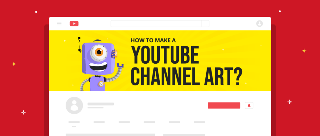
Among the myriad of elements that contribute to a successful YouTube channel, the channel banner holds a special place. Serving as the visual centerpiece of your channel’s homepage, your banner is the first impression visitors get of your brand, personality, and content style. Crafting an engaging and professional banner is essential for attracting viewers, conveying your channel’s identity, and encouraging them to explore your content further.
In this comprehensive guide, we will delve into the intricacies of setting up your YouTube channel banner, covering everything from design principles and technical specifications to best practices and creative inspiration. Whether you’re a seasoned creator looking to refresh your channel’s look or a newcomer eager to make a splash, this guide will equip you with the knowledge and tools you need to create a compelling and visually stunning banner that captures the essence of your channel.
Understanding the Importance of Your YouTube Channel Banner
Before diving into the nitty-gritty of banner design, it’s crucial to understand why your channel banner matters. Your banner serves as a visual representation of your brand identity and content niche, providing visitors with valuable insights into what they can expect from your channel. Here are some key reasons why your channel banner is important:
- First Impression: Your banner is often the first thing visitors see when they land on your channel homepage. A well-designed banner can make a strong first impression and pique viewers’ interest in exploring your content further.
- Brand Identity: Your banner is an opportunity to showcase your brand identity, including your logo, color scheme, and visual style. Consistent branding helps build recognition and trust among your audience.
- Content Focus: A strategically crafted banner can convey the type of content you create and the audience you cater to. Whether you’re a gaming enthusiast, beauty guru, or educational vlogger, your banner should reflect your niche and content themes.
- Call to Action: Your banner can include a call to action (CTA) that encourages viewers to subscribe to your channel, follow you on social media, or visit your website. A compelling CTA can help drive engagement and grow your audience.
Designing Your YouTube Channel Banner
Now that we’ve established the importance of your channel banner, let’s dive into the design process. Designing an effective banner requires a combination of creativity, visual appeal, and strategic thinking. Here are the key steps to consider when designing your banner:
1. Define Your Brand Identity
Before you start designing your banner, take some time to define your brand identity. Consider aspects such as your channel’s niche, target audience, and unique selling points. Your banner should reflect these elements and communicate them visually to viewers. Ask yourself:
- What is the main theme or focus of my channel?
- Who is my target audience, and what are their interests?
- What sets my channel apart from others in my niche?
2. Choose the Right Dimensions and File Format
YouTube recommends using a banner image with dimensions of 2560 x 1440 pixels, with a maximum file size of 6MB. However, it’s essential to keep in mind that the banner will be displayed differently across various devices (desktop, mobile, TV). To ensure compatibility, place essential elements (such as text and logos) within the safe area, which is approximately 1546 x 423 pixels in the center of the banner.
As for the file format, YouTube accepts JPEG, PNG, BMP, and GIF files. However, for optimal image quality and compatibility, PNG is often the preferred choice.
3. Create Compelling Visuals
When it comes to designing your banner, visual appeal is paramount. Use high-quality images, graphics, and typography to create a visually striking composition that captures viewers’ attention. Here are some tips for creating compelling visuals:
- Use eye-catching imagery that represents your channel’s content and theme.
- Incorporate your channel logo or name prominently to enhance brand recognition.
- Choose a cohesive color scheme that reflects your brand identity and complements your content.
- Experiment with typography to create a distinctive look for your channel name and any additional text.
4. Keep It Simple and Clear
While it’s tempting to cram as much information as possible into your banner, simplicity is key to effective design. Avoid cluttering your banner with too many elements or excessive text, as this can overwhelm viewers and dilute your message. Instead, focus on conveying your channel’s essence concisely and clearly. Here are some guidelines to follow:
- Limit the amount of text on your banner to essential information, such as your channel name and tagline.
- Use whitespace strategically to create balance and emphasize important elements.
- Ensure that your text is legible and easy to read, even at smaller screen sizes.
- Maintain visual hierarchy by prioritizing the most critical elements and arranging them accordingly.
5. Optimize for Different Devices
Given that viewers access YouTube from various devices, it’s crucial to optimize your banner for different screen sizes. Test your banner across desktop, mobile, and TV devices to ensure that it displays correctly and maintains its visual impact across all platforms. Pay attention to how your banner’s composition and text placement may need to adapt to different screen dimensions.
6. Incorporate a Call to Action (CTA)
Encourage viewer engagement and channel growth by incorporating a clear call to action (CTA) into your banner. Whether it’s prompting viewers to subscribe, watch a specific video, or follow you on social media, a well-crafted CTA can motivate viewers to take action. Keep your CTA concise and actionable, using compelling language and visual cues to draw attention.
Best Practices and Creative Inspiration
Now that you have a solid understanding of the design process, let’s explore some best practices and creative inspiration to help you create a standout YouTube channel banner:
- Be Authentic: Let your channel’s personality shine through in your banner. Authenticity resonates with viewers and helps build a genuine connection with your audience.
- Stay Consistent: Maintain consistency in your branding across all aspects of your channel, including your banner, profile picture, thumbnails, and video content. Consistency breeds familiarity and reinforces your brand identity.
- Stay Updated: Regularly update your banner to reflect changes in your channel, such as new content series, collaborations, or milestones. Keeping your banner fresh shows that your channel is active and engaged.
- Study Your Competitors: Take inspiration from successful channels in your niche, but strive to differentiate yourself with a unique visual style and message. Analyze what works well for others and adapt it to fit your brand identity.
- Seek Feedback: Don’t hesitate to seek feedback from friends, fellow creators, or your audience during the design process. Fresh perspectives can offer valuable insights and help you refine your banner until it’s just right.
- Stay Within YouTube Guidelines: Familiarize yourself with YouTube’s community guidelines and policies regarding channel art to ensure that your banner complies with their standards. Avoid using copyrighted material or any content that violates YouTube’s terms of service.
Conclusion
Your YouTube channel banner is a powerful tool for shaping your channel’s identity, attracting viewers, and driving engagement. By following the principles and best practices outlined in this guide, you can create a compelling and visually stunning banner that captures the essence of your channel and leaves a lasting impression on viewers.
Remember to stay true to your brand identity, keep your design simple and clear, and regularly update your banner to reflect changes in your channel. With creativity, strategic thinking, and a keen eye for design, you can set your YouTube channel apart and create a visual identity that resonates with your audience.
So, what are you waiting for? Roll up your sleeves, unleash your creativity, and let your channel banner become the beacon that guides viewers on an exciting journey through your content universe. Happy designing!
