Navigating the Digital Realm: Unveiling the Truth About Image Resolution, File Size, and the Web

Introduction:
In the fast-paced digital landscape, where visuals reign supreme, understanding the intricate relationship between image resolution, file size, and web optimization is paramount. Every pixel, byte, and compression choice can significantly impact the user experience, website performance, and overall aesthetic appeal. In this exhaustive exploration, we unravel the truth about image resolution, file size, and their profound implications for the web.
Decoding Image Resolution:
- Defining Image Resolution:
- Image resolution refers to the number of pixels packed into a given space within an image.
- Commonly expressed as pixels per inch (PPI) or dots per inch (DPI), it determines the clarity and sharpness of an image.
- Web vs. Print Resolution:
- Recognizing the disparity between web and print resolution standards.
- Understanding that higher resolutions are not always beneficial for web images, as they may contribute to unnecessary file bloat.
Understanding File Size:
- Comprehending File Size in the Digital World:
- File size is the amount of digital space an image occupies.
- Factors influencing file size include image resolution, color depth, and compression.
- Impact of File Size on Website Performance:
- Delving into the implications of large file sizes on website loading times.
- Recognizing the critical role of optimized images in enhancing user experience and reducing bounce rates.
Optimizing Images for the Web:
- Choosing the Right File Format:
- Analyzing the characteristics of common image formats like JPEG, PNG, and GIF.
- Understanding when to use each format based on the type of image and desired outcome.
- Strategies for Compression:
- Unraveling the art of compression and its role in reducing file sizes.
- Balancing compression ratios to maintain acceptable image quality while minimizing file bloat.
- Responsive Images for Varied Devices:
- Navigating the necessity of responsive images to accommodate diverse devices and screen sizes.
- Implementing techniques like the “srcset” attribute in HTML for optimal display on different devices.
Addressing Common Misconceptions:
- Myth: Higher Resolution Always Means Better Quality:
- Dispelling the myth that higher resolution guarantees superior image quality, especially in the context of the web.
- Emphasizing the importance of balancing resolution with practical considerations.
- Myth: All Images Must be High-Resolution for Web Use:
- Challenging the misconception that every image destined for the web must be high-resolution.
- Advocating for a nuanced approach that considers the specific requirements of each web project.
Tools and Techniques for Effective Management:
- Utilizing Image Editing Software:
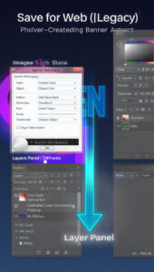
- Harnessing the capabilities of image editing software like Adobe Photoshop for resolution adjustments and compression.
- Navigating the software’s features to strike the right balance between quality and file size.
- Web-Based Tools for Optimization:
- Exploring online tools and platforms dedicated to image optimization for the web.
- Analyzing their features, functionalities, and effectiveness in streamlining the optimization process.
Conclusion:
In the dynamic realm of the web, where visual content is a cornerstone of engagement, the truth about image resolution, file size, and optimization is a compass for digital creators. Armed with a profound understanding of the intricacies involved, one can navigate the challenges, make informed decisions, and ensure that every pixel contributes meaningfully to an enhanced online experience. So, let this comprehensive guide be your roadmap to mastering the delicate balance between image resolution, file size, and the demands of the ever-evolving web.


