The Step-by-Step Guide to Manually Separating Spot Colors in Photoshop for Screen Printing Logos
The Step-by-Step Guide to Manually Separating Spot Colors in Photoshop for Screen Printing Logos
When it comes to creating for digital or regular print, designing for screen printing logos takes an entirely different mentality. Instead of dealing with visuals that are in full color, you will be working with real layers of ink that will be produced one color at a time via different screens. Because every color in your design will be converted into a physical plate, the structure of your Photoshop file has to be organized in such a manner that it will be possible to isolate each color in a way that is both clean and accurate. Manual spot color separation is one of the most significant technical abilities in screen printing because it allows you to have complete control over the behavior of each ink layer on the surface or garment that will ultimately be printed on throughout the process. In the event that it is carried out appropriately, it guarantees crisp edges, uniform colors, and print outputs that are predictable.
Comprehending the Meaning Behind the Actual Concept of Spot Color Separation
Spot color separation is the process of splitting a design that contains several colors into discrete layers of solid colors, with each layer representing a different ink that will be printed using a separate printing process. When it comes to creating tones, screen printing does not depend on the process of combining very small bits of color as CMYK or RGB printing does. Instead, each color is produced as a solid piece of ink that is flat. This indicates that gradients, shadows, and complicated blends need to be reduced into distinct forms by simplifying them. Using Photoshop, it is your responsibility to transform a visual design into a collection of clean, separate color plates that can be reproduced by a screen printer at the physical level. By going through this procedure, a digital picture of a logo is converted into a file that is suitable for manufacturing.
Some Reasons Why Automatic Separation Tools Frequently Fail
There are a lot of designers that depend on automated separation tools or plugins, however the results that these tools often provide for professional screen printing are not very good. There is a tendency for automatic tools to produce color variations that are not essential, edges that are sloppy, and tones that overlap, all of which are hard to print neatly. To add insult to injury, they do not have a contextual grasp of how inks interact physically on paper or cloth. When you manually separate the components, on the other hand, you are required to make deliberate choices about each and every color, edge, and form. When it comes to logos, where brand correctness, clarity, and consistency are of the utmost importance, this level of control is absolutely necessary. Even though automatic instruments are more efficient, manual separation is more dependable.
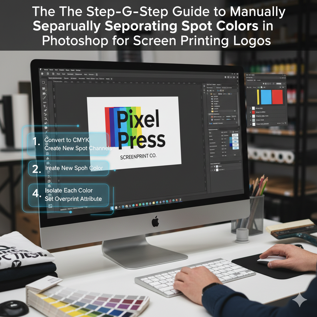
Implementing the Appropriate Document Settings in Photoshop
It is imperative that your Photoshop document be well organized before you begin the process of color separation. For the purpose of maintaining the integrity of the edges, the canvas size should be the same as the precise print size of the logo, and the resolution should be at least 300 dots per inch. When we work at a high resolution, we assure that the curves, lettering, and small details that are burnt into displays will retain their crispness. As opposed to being white, the backdrop need to be transparent so that each color layer may be seen in isolation with complete clarity. Additionally, if your logo was created from a vector file, it is essential to convert it to a flattened raster form using Photoshop. This will ensure that all shapes function in the same manner inside the program.
Constructing a Print Feasibility Analysis of the Logo
There are certain logos that are not suitable for screen printing in their initial state. The use of spot colors is not possible for many logos because they incorporate gradients, shadows, glows, or delicate color changes that cannot be replicated. Prior to separating anything, you are required to do an analysis of the design and determine the number of inks that are really required. Every extra color raises the manufacturing cost and increases the level of complexity. The exercise of design judgment comes into play at this point. There is a possibility that you will need to consolidate gradients into solid forms, decrease the number of colors, or redraw minute features that would not be able to withstand the printing process. Having a realistic grasp of what the press is truly capable of producing is always the first step in creating a proper separation.
Changing the Design of the Logo to Include Flat Color Areas
When it comes to manual separation, the first step that is feasible is to transform the logo into parts that are flat and solid in color. The removal of gradients, layer styles, shadows, and effects is often required for this. It is necessary for every visible color to transform into a shape that is devoid of any interior shading. It is possible to isolate certain colors with the use of tools such as the Magic Wand, Select Color Range, and the Pen Tool. After being picked, the regions in question have to be filled with a single solid color by using either the Paint Bucket or Fill command. At this point, your logo ought to start seeming less complicated and more visual, which is just what is required for screen printing.
Methods for Developing Individual Color Channels
It is necessary for every spot color to reside on its own separate layer. In order to get a professional workflow, it is necessary to first duplicate the primary design and then isolate one color from each layer. You should end up with three distinct layers, each of which has just one color and transparency everywhere else. For instance, if your logo utilizes red, black, and white, you should develop three distinct layers. These layers are the displays that you will use in the future. One of the most important things to do in order to minimize misunderstanding later on in the manufacturing process is to explicitly name layers, such as “Red Ink,” “Black Ink,” and “White Underbase.” This format also makes it simple for printers to comprehend and use the files you have provided.
Making Use of Levels and Thresholds to Achieve Clean Edges
There is a possibility that the borders of logos that originate from photographs or sources of poor quality may seem fuzzy or soft. Printing on a screen demands edges that are sharp and tidy. At this point, the use of tools such as Levels and Threshold becomes quite significant. Adjusting the contrast allows you to transform soft pixels into either pure black or pure white, so removing any fuzzy edges that may be present. Because it immediately transforms grayscale regions into solid shapes, threshold is an exceptionally helpful tool. Through the completion of this phase, you will guarantee that your screens will burn with sharp edges and that the ink will not bleed in an unpredictable manner during printing.
Taking Care of Colors That Are Overlapping and Trapping
When two colors reach each other or overlap, you have to determine how they physically interact with one another. This kind of screen printing involves the layering of inks, and even a minor misalignment may result in gaps between the colors. Trapping, which implies slightly overlapping neighboring colors, is a technique that printers utilize to avoid this from happening. This may be accomplished in Photoshop by extending one color slightly beneath another by using the Select and Expand tool or by manually changing the shapes being used. The process of trapping assures that there will be no discernible white spaces between colors, even in the event that the displays move somewhat. For prints of high quality, this is a step that is not obvious but very necessary.
Establishing a White Underbase for Garments of a Certain Color
When printing on dark materials, it is nearly always necessary to use a white underbase. This white layer is placed behind all of the other colors, and it gives the impression that they are dynamic rather than drab. For the purpose of creating the underbase in Photoshop, all of the color shapes are combined into a single layer that is pure white. The screen that this layer creates is its own. To ensure that no black cloth is visible through, it is necessary to use trapping methods and make it slightly bigger than the color layers that are on top. In the absence of an appropriate underbase, colors, when applied to dark clothes, will seem muddy and inconsistent.
Channels for the Purpose of Previewing Separations
Making use of the Channels panel in Photoshop is among the most effective methods for checking the quality of your work. By considering each hue to be a black-and-white mask, you may create the appearance of spot plates. The only color that should be shown on each channel is a solid black hue, and everything else should be white. You will get a more accurate idea of how each screen will seem when it has been burnt thanks to this. If a channel seems to be cluttered, loud, or inconsistent, this indicates that your separation is not up to the standards required for production.
Assembling a Print Plate for Each Individual Color
After the separations have been finished, each color layer has to be exported or saved as its own print plate. The majority of screen printers choose to show each hue as a black form on a backdrop that is transparent. This is due to the fact that the black regions indicate the portions of the screen that will allow ink to get through. Printing is done on these plates, which are then either transferred straight to screen exposure devices or printed onto film negatives. At this point, the file you created in Photoshop is no longer only a design; rather, it is a blueprint for the manufacturing process.
Mistakes that are Frequently Made by Beginners
Anti-aliasing or soft edges are left in the design, which is one of the most typical blunders that designers do. These result in pixels that are only partially transparent and they cannot be printed precisely. The use of an excessive number of colors is another mistake that may result in manufacturing that is both costly and prone to errors. It is also common for beginners to forget about trapping, which might result in gaps that are evident in the final print. As a last point, a lot of designers forget to get rid of extraneous details that seem great on the computer but are entirely lost when they are printed on cloth. You are forced to think like a printer, rather than merely a designer, when you are manually separated.
Several Reasons Why Manual Separation Is Still the Industry Standard
Manual spot color separation continues to be the industry standard for high-quality screen printing, despite the fact that contemporary RIP software and automation solutions are available now. It offers complete control, outputs that are able to be predicted, and complete compliance with the workflow requirements of any print business. Furthermore, it enables you to build with the actual world in mind rather than depending on algorithms, which is a significant advantage. The process of carefully separating colors allows you to have a complete understanding of how each ink layer will behave on the finalized product. The screen printing process is transformed from one of trial and error into a manufacturing system that is accurate and professional as a result of this.
This is the reason why spot color separation is not only a design skill but also a production skill.
In the process of manually separating colors, it is not enough to just make something appear nice. Specifically, it is about preparing a file that can be created in a physical manner. The behavior of the ink, the interaction between the fabric and the ink, registration problems, and printing constraints are all necessary for this. Spot color separation is a technique that designers who are able to grasp become much more useful since they remove mistakes before they are sent to the press. In addition to reducing waste and saving time, they generate prints of a consistent and high-quality. When it comes to professional screen printing, clear separations are not something that can be skipped due to the fact that they serve as the basis for everything else.