Taskbar Triumph: Unveiling the Slicker, Quicker Taskbar Previews in Windows 7
Introduction
In the ever-evolving landscape of operating systems, Windows 7 distinguished itself as a transformative release, introducing a myriad of features that elevated user experience. Among the standout innovations was the revamped Taskbar, adorned with Slicker and Quicker Taskbar Previews. In this exhaustive exploration, we unravel the intricacies of this groundbreaking enhancement, shedding light on how it streamlined user workflows, prioritized multitasking, and transformed the way users interacted with their applications.
The Evolution of Taskbar Previews: A User-Centric Upgrade
Taskbar Previews in Windows 7 represented a paradigm shift in how users interacted with open applications. Unlike their predecessors, which offered limited information through static icons, Windows 7 introduced dynamic previews that provided real-time glimpses into the content and activity of open windows. This evolution was not merely cosmetic but a deliberate move towards a more user-centric and intuitive computing experience.
Hovering Magic: Instantaneous Window Previews
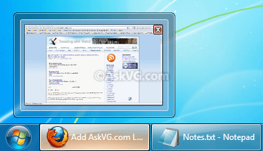
One of the key elements of the Slicker, Quicker Taskbar Previews was their instantaneous responsiveness. Users could hover their mouse over an application icon in the Taskbar, and a live, thumbnail preview of the open window would emerge, giving users a quick and comprehensive overview of the application’s status.
This “hovering magic” revolutionized the way users navigated between open applications, providing a visual roadmap of their digital workspace. Whether it was monitoring multiple browser tabs, checking email contents, or previewing documents, the instantaneous nature of Taskbar Previews in Windows 7 ensured that users could make informed decisions about where to direct their attention with unmatched efficiency.
Live Thumbnails: A Glimpse into the Digital Realm
Taskbar Previews in Windows 7 went beyond static thumbnails, introducing the concept of live thumbnails. These dynamic previews offered users more than just a snapshot; they provided real-time updates on the content and activity within each open application. From video playback to scrolling through documents, users could witness the ongoing actions within the window without actually switching to it.
This live thumbnail functionality brought a level of interactivity to the Taskbar that was previously unseen. Users could gauge the progress of a download, monitor the status of a video call, or track changes in a collaborative document, all without leaving their current task. The integration of live thumbnails exemplified Microsoft’s commitment to providing users with a more immersive and responsive computing environment.
Aero Peek: A Glimpse Behind the Curtain
Complementing the Slicker, Quicker Taskbar Previews was the introduction of Aero Peek. This feature allowed users to “peek” behind open windows to get a quick look at the desktop. By hovering over the “Show Desktop” button on the far right of the Taskbar, users could temporarily minimize all open windows and see the desktop, providing a momentary respite from a cluttered digital workspace.
Aero Peek not only enhanced the visual appeal of Taskbar Previews but also served as a practical tool for users who needed a momentary distraction-free view of their desktop. This feature exemplified the thoughtful design philosophy that permeated Windows 7, acknowledging the diverse needs of users and providing intuitive solutions.
Taskbar Grouping: Streamlining Multitasking
Multitasking reached new heights of efficiency with the Taskbar Previews in Windows 7, thanks to the introduction of Taskbar Grouping. When multiple instances of the same application were open, the Taskbar intelligently grouped them under a single icon, with each instance accessible through a convenient jump list.
This grouping not only saved precious Taskbar real estate but also streamlined the user experience. Navigating between multiple instances of an application became a seamless process, with users able to preview and switch between documents, spreadsheets, or browser tabs without the need for cumbersome navigation.
Customization and Personalization: Tailoring the Taskbar Experience
Recognizing that user preferences vary, Windows 7 empowered users with a high degree of customization for Taskbar Previews. Users could adjust the size of the thumbnail previews, enabling them to strike the perfect balance between information density and visual aesthetics. The ability to turn off previews for specific applications or adjust the delay before previews appeared added an extra layer of personalization, ensuring that Taskbar Previews adapted to individual workflow preferences.
This emphasis on customization not only enhanced the user experience but also underscored Microsoft’s commitment to providing a flexible and user-friendly operating system. Windows 7 users could tailor the Taskbar to suit their unique needs, ensuring that the Slicker, Quicker Taskbar Previews seamlessly integrated into their digital routines.
Accessibility and Ease of Use: Inclusive Design Philosophy
Windows 7’s Taskbar Previews embodied an inclusive design philosophy, prioritizing accessibility and ease of use. The feature was designed to be intuitive for users of all levels of technical proficiency, minimizing the learning curve associated with navigating a new operating system.
The visual cues provided by Taskbar Previews, from live thumbnails to Aero Peek, were designed with clarity and simplicity in mind. Users could quickly grasp the functionality and incorporate it into their daily workflows without feeling overwhelmed. This commitment to accessibility contributed to the widespread adoption and positive reception of Windows 7.
Conclusion
The Slicker, Quicker Taskbar Previews in Windows 7 weren’t merely a visual upgrade; they represented a significant leap forward in the evolution of user interfaces. Windows 7’s Taskbar Previews seamlessly blended aesthetics with functionality, providing users with a dynamic, informative, and responsive tool for managing their digital workspace.
As users navigated through the labyrinth of open applications and documents, Taskbar Previews became an indispensable guide, offering a quick and insightful preview into the digital realm. The instantaneous nature, live thumbnails, Aero Peek, and Taskbar Grouping collectively transformed the way users interacted with their applications, making multitasking more efficient and user workflows more streamlined.
In the legacy of Windows operating systems, the Slicker, Quicker Taskbar Previews of Windows 7 remain a testament to Microsoft’s commitment to innovation and user-centric design. This feature not only left an indelible mark on the Windows ecosystem but also influenced the trajectory of user interface design across the digital landscape. Windows 7’s Taskbar Previews weren’t just a visual enhancement; they were a dynamic manifestation of Microsoft’s vision for a more intuitive, responsive, and user-friendly computing experience.
