Building Custom Displacement Maps from Scratch for Hyper-Realistic Apparel and Packaging Mockups
Building Custom Displacement Maps from Scratch for Hyper-Realistic Apparel and Packaging Mockups
As a result of the fact that clients and consumers want digital previews to closely resemble actual items, realistic mockups are a vital component of contemporary branding, garment design, and package presentation. When it comes to placing images onto surfaces, smart objects and blending modes are helpful; yet, they often fail to recreate the natural distortions that are created by folds, curves, wrinkles, or thickness of the material. Displacement maps solve this limitation by using grayscale image data to control how a design bends and conforms to an underlying surface. In order to produce a result that is far more believable, the artwork is able to conform to the structure and texture of the item, rather than seeming flat. Building custom displacement maps from scratch provides greater accuracy than relying on generic templates because each product surface has unique lighting, contours, and material behavior. When it comes to creating professional mockups that seem realistic upon closer scrutiny, having a solid understanding of how to generate and improve these maps is quite necessary. A significant number of industries, including commercial advertising, fashion visualization, and high-end product presentation, make extensive use of this approach.
Acquiring Knowledge about the Operation of Displacement Maps
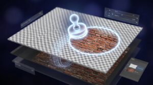
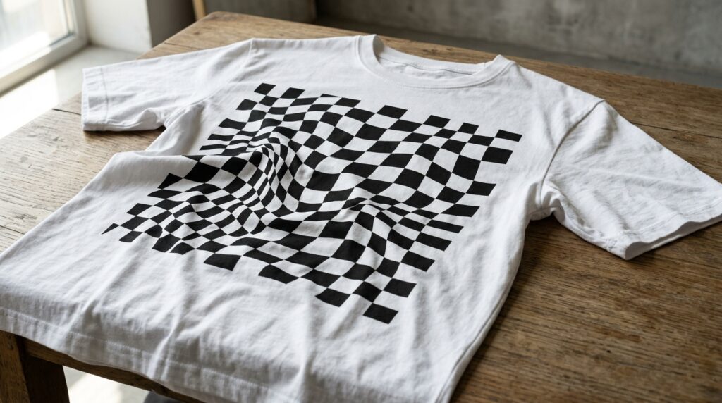
You may think of a displacement map as a grayscale reference file that instructs Photoshop on how to distort a picture depending on the tonal values the image contains. This creates the appearance that the artwork follows the contour of the surface underneath it, since the lighter portions push pixels in one way while the darker areas pull them in another direction. Mid-gray values generally produce little or no distortion, acting as neutral zones. The use of this technology makes it possible for logos, patterns, or labels to wrap around folds, seams, wrinkles, and curved packaging surfaces in a spontaneous manner. When compared to straightforward warp transformations, displacement maps are able to produce distortions that are more convincing because they respond to the real tonal structure present within the reference picture. Before beginning to construct custom maps, it is vital to have a solid understanding of the link between grayscale contrast and pixel mobility. A properly designed displacement map ensures that graphics integrate realistically instead of appearing artificially overlaid.
Getting the Base Image Ready for the Creation of the Map
In a significant way, the preparation of the source picture is what determines the quality of a displacement map. It is recommended that the product image be cleaned and optimized before to the generation of the map in order to highlight surface features and lighting changes specifically. As a result of the fact that dust, distractions, and needless shadows might interfere with the accuracy of the distortion, it is important to reduce their presence. By converting the picture into a simpler tonal structure, Photoshop is able to more accurately read the surface when it comes to doing displacement calculations. The use of high-resolution photos is especially vital for mockups of garments and packaging since the inclusion of minute creases and different textures of materials contributes greatly to the overall sense of realism. Through proper preparation of the picture, it is possible to guarantee that the final displacement map will accurately represent the fundamental physical attributes of the item without adding any undesirable distortions.
The process of converting surface detail into grayscale information
As a result of the fact that displacement maps are fully dependent on grayscale data, the conversion of the base picture is an essential operation. It is not enough to just eliminate color; rather, the objective is to provide a tonal representation that truly portrays the amount of depth and structure existing on the surface. When it comes to transitions, sections with a high contrast should correlate to strong folds or curves, while areas with softer gradients should reflect gentler transitions. It is usual practice to make adjustments to the grayscale picture, such as levels and curves, in order to emphasize the contours that are most significant. Avoiding excessive contrast is important since it has the potential to produce distortion that is not realistic throughout the application process. Due to the fact that the grayscale conversion process is responsible for determining the degree to which the finished artwork adheres to the object in a natural manner, tonal balance is one of the most significant variables in the effective generation of displacement maps.
Improving the Shapes of Packaging Contours and Wrinkles in Fabric
Wrinkles and folds are the key qualities that contribute to the creation of realism in clothes mockups, while edges, curves, and surface depth are more important in the creation of realism in package mockups. It is possible to increase the accuracy of the final distortion effect by further enhancing these structural features included inside the displacement map. The use of subtle sharpening or small contrast modifications may assist in defining significant regions of texture without going overboard with the technique. For the purpose of ensuring that graphics flex organically with the garment, it is sometimes necessary to place extra focus on seam lines and stretched fabric areas in clothing mockups. When it comes to the design of packaging, curved surfaces like bottles or flexible pouches need smooth tonal gradients in order to give the impression that the label wrapping should be genuine. It is possible to achieve a more believable integration by adapting the map to include the particular material properties of the product.
For the purpose of preserving and correctly constructing the displacement map
Immediately after the grayscale reference picture has been improved, it is necessary to save it in a format that is compatible with the process of the displacement filter in Photoshop. It is important to keep the file flattened and devoid of any extra layers in order to prevent any issues during the processing stage. A mismatch in resolutions might result in distorted or incorrect results, thus it is essential to keep the size of the mockup picture you are working with the same as the target image. It is possible to increase workflow efficiency by organizing displacement maps in folders that are properly labeled. This is particularly beneficial for projects that include several product variants. In commercial settings, where it is necessary to produce mockups that are consistent across a variety of campaigns or branding materials, proper file management is becoming an increasingly crucial aspect.
Utilization of Displacement Maps in the Design of Intelligent Objects
Smart Objects are the most efficient method for applying displacement maps because they maintain the flexibility to change the mockup and enable artwork adjustments without requiring the mockup to be rebuilt from the ground up. Following the incorporation of the design into a Smart Object, the displacement filter is able to make reference to the individualized map and reshape the artwork in accordance with the surface structure. Intensity of horizontal and vertical distortion is determined by scale settings, and these values need to be adjusted carefully depending on the material and depth of the item being seen. Although inadequate settings may result in a flat look, excessive displacement might cause stretching that is not realistic. Through the whole of the design process, the use of Smart Objects guarantees that revisions will continue to be non-destructive and adaptable.
The use of Blending and Lighting Adjustments in conjunction with Displacement
On its own, displacement is not sufficient to finish off a realistic mockup. Following the application of distortion, the artwork must still be able to blend in with the lighting and texture of the surface it was originally created on. It is possible to achieve a more natural integration of the design into the material by using blending modes like as Multiply, Overlay, or Soft Light. To get a match between the highlights, shadows, and surface reflections, it may be necessary to make further modifications. It is possible to achieve a higher level of realism in clothes mockups by keeping the look of fabric grain with the use of slight texture visible through the printed pattern. When it comes to packaging mockups, regulated reflections and gloss effects that are in matching with the product material are often beneficial. It is possible to produce a final picture that is cohesive and convincing by combining displacement with modifications to the tonal and lighting aspects.
Finding Solutions to the Most Frequent Issues in Displacement Workflows
There are a number of frequent errors that might potentially affect the efficiency of displacement maps. For example, a map with an excessively high contrast may result in jagged distortions, while maps with a low level of detail may give results that are flat and artificial. Stretched images that do not line with the surface structure are often the result of scaling parameters that are incorrect. Not taking into account the inherent material behavior of the product is another problem that arises. This leads to distortions that do not correspond to the way that cloth or packaging would flex in a genuine situation. In addition to this, it is essential to examine the mockup at a variety of zoom levels in order to spot instances of unnatural edges or repeating texture patterns. For the purpose of obtaining professional-quality outcomes that continue to be persuasive even after extended scrutiny, careful refining and testing are needed.