Correcting White Balance Discrepancies Across Stitched Panoramic Photo Merges Using Camera Raw Filter in Photoshop
Correcting White Balance Discrepancies Across Stitched Panoramic Photo Merges Using Camera Raw Filter in Photoshop
It is not enough to simply align overlapping photos and use their edges to create a seamless panoramic photo. If the various images were taken under varied lighting circumstances or camera settings, then the resultant panorama can have obvious color changes, uneven warmth or inconsistent brightness in different parts. These differences are best seen in skies, snow-covered landscapes, architectural surfaces and other areas of generally consistent color. Photoshop has a number of tools to help fix these problems, and the Camera Raw Filter gives you exact control over white balance, temperature, tint, exposure and color rendering. Used judiciously, these modifications can help photographers optimize tonal consistency without undue sacrifice of image detail or natural color relationships. But to fix a stitched panorama, you have to understand how the source photos were taken, how Photoshop blended their overlaps, and how global modifications affect the entire composite. However, using a single white balance adjustment may not cure all the differences when the source photos have highly diverse lighting conditions. A systematic procedure involving Camera Raw modifications, localized corrections, masks and thorough visual examination will create more natural panoramic photos while retaining the flexibility necessary for professional photo editing.
Understanding White Balance Differences in Panorama Images
White balance is the way a photograph depicts neutral colors in a specific lighting situation. A correctly adjusted white balance will make items that should be neutral white or neutral gray seem as such, without any undesired yellow, blue, green, or magenta color casts. The problem with panoramic photography is that each source shot may be taken at a slightly different moment, especially when the light changes rapidly. If you choose automatic white balance , it can handle each frame separately , resulting in uneven color temperature in the panoramic . One image can seem warmer because the camera is picking up golden sunlight, and another might be colder because there’s more blue sky or darkness in the frame. Matching color might be even harder with different exposure settings, mixed artificial lighting, reflections and shifting cloud cover. The variations may be small in any one photograph, but when the images are stitched together they become clear. Before you start correcting, check the panorama at full size and see if the fault exists across the composite or is confined to particular areas. This distinction is important since a global correction is appropriate for a general color cast whereas localized inconsistencies usually require additional corrections. By knowing the root of the mismatch you may avoid over-editing and keep the natural look of the scene.
Setting up the Panorama for Non-Destructive Editing
A good workflow starts with locking down the original panorama and creating a flexible editing structure. Open the stitched image in Photoshop and save as a PSD or PSB file, depending on the document dimensions and file-size requirements. If the panorama was made using Photoshop’s Photomerge feature then keep the original combined layers if you can because they can be very helpful in fixing particular parts. Duplicate the composite layer before doing any heavy color alterations, or convert the layer to a Smart Object when applicable. A Smart Object allows you to return and change Camera Raw Filter settings without permanently changing the underlying pixel data. To do that, choose the proper layer, right-click and choose Convert to Smart Object. Next, look for noticeable stitching artifacts, visible seams, inconsistent exposure, color variances near overlapping areas. If serious alignment or blending errors are corrected before final color grading, the process of white balancing might be more predictable. Don’t flatten the document too soon; you may require distinct layers and masks to pinpoint individual color incompatibilities. This creates a non-destructive framework, which makes it easier to compare alterations, revert unsuccessful changes and fine-tune the panorama without having to rebuild the composite over and over again.
Go to Filter > Camera Raw Filter . Setting a Neutral Baseline
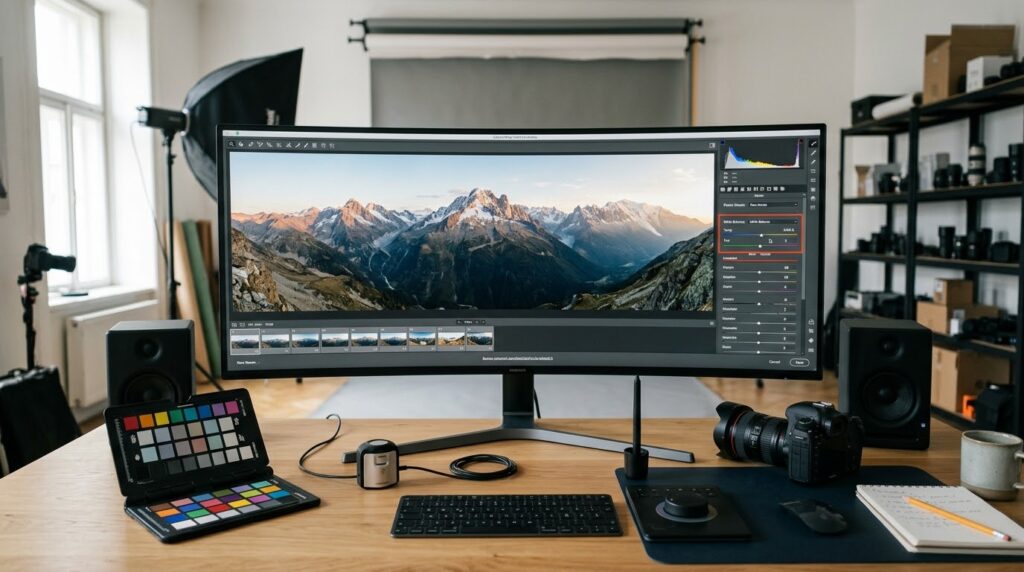
In Photoshop, the Camera Raw Filter allows you access to many of the tonal and color adjustments that are available in Adobe Camera Raw. To utilize it choose the relevant image layer or Smart Object and click Filter, then Camera Raw Filter. Although the interface may be a little different from one installed version of Photoshop to another, the main white balance options are usually placed in the Color area of the Edit panel. Temperature controls the overall blue to yellow balance; Tint controls the green to magenta balance. Before you start making big modifications, take a look at the panorama under uniform viewing conditions and create a firm baseline. Look for regions that should be neutral. White buildings . Gray pavement . Neutral clouds . Known white objects . But not all white looking areas are a good reference. Reflected light, colored shadows, climatic conditions and surface materials all have a role in the true hue. If the whole panorama is cast in a cold or warm tone, moderate global modifications may be an appropriate beginning point. Just make modest modifications and look at the image, rather than trying to make every section match some supposed neutral white. In the natural scene, there are valid temperature changes and their complete removal might make the photo look unnatural. Once the general color balance is in order, determine if some areas still need more adjustment.
Match Temperature and Tint on the Composite
Temperature and tint variables are some of the most critical for resolving white balance anomalies in a panoramic image. Temperature is mostly about correcting disparities between warm yellow-orange and cool blue tones. Tint is about correcting changes along the green-magenta axis. If one half of a panorama appears golden while the other side is distinctly blue, a slight change in temperature may help to lessen the disparity. But, adjusting the global temperature slider changes the whole picture, even parts that could already be in balance. Therefore, examine several regions rather than analyzing the adjustment from one region. See if the correction makes the picture more consistent when viewing the sky, foreground, faraway landscape and any big neutral areas. If one region is becoming too warm and another too chilly, the difference is likely best handled locally, rather than with a stronger global change. Tint should also be given equal consideration, as mixed lighting and automatic camera processing might result in green or magenta changes that temperature alone cannot correct. It is also important not to assume that the same numerical temperature value would get the same results for different images taken with different cameras or processed with different profiles. It is about visual consistency, not the same value of the slider. Do subtle tweaks, compare the before and after shot, and maintain plausible changes generated by real lighting circumstances.
Masks for Localized White Balance Corrections
If you have localized color differences in a panorama, you can do a lot more with masking than you can with ever more severe global modifications. Photoshop allows users to create adjustment layers including Smart Object adjustment based on Camera Raw Filter, and selectively toggle their effects on or off. A realistic solution is to duplicate the relevant layer, apply a corrective Camera Raw Filter adjustment, and add a layer mask to limit the correction to the affected region. Or you can utilize adjustment layers such as Color Balance or Selective Color when those tools give a more appropriate targeted correction. First, outline the approximate limits of the mismatched area, particularly where two source pictures overlap. With a gentle brush, gently sweep the mask to gradually mix the correction into surrounding areas. Avoid harsh transitions if you can; these will create fresh apparent seams that are even more irritating than the original mismatch of colors. In the case of a complex-shaped disparity, a well adjusted selection or gradient mask can do a better job than freehand painting. If the corrected region is too saturated or unnatural, reduce the opacity of the repair. Verify the transition at both fit-to-screen and full resolution magnifications. Localized corrections should be part of the whole panorama and not just patches of color grade.
White Balance Correction using Exposure and Contrast Correction
Differences in exposure, contrast and shadow detail are often seen together with white balance anomalies. Sometimes a part of a panorama could look cooler or warmer because it is brighter or darker or there is haze in the atmosphere. If these tonal variances are not corrected, the temperature correction can leave the composite looking visually uneven. You can use the Camera Raw filter to balance the image before final color tweaking by adjusting exposure, highlights, shadows, whites, and blacks. Start with the overall tone balance and don’t adjust lots of parameters at once. If one region is obviously darker than its neighbors, some small adjustment of the exposure may help continuity, but if you raise the exposure too much, you may see noise or washed-out detail. The highlights and shadows can aid in restoring visual harmony when there are brilliant skies and darker foregrounds, but they can’t restore information that was never collected. Adjustments with the histogram and apparent detail in the image to ensure a realistic tonal range is maintained. If the source photos vary greatly in exposure, you might want to use separate Smart Objects or masked fixes for the affected areas. Watch out for stitched boundaries. Even if the colors line up, you can get noticeable bands of brightness at spots where the exposure changes. The reconstructed panorama should maintain the depth and lighting properties of the original picture and ensure consistent tonal transitions.
Dealing with Camera Raw Rendering Differences and Color Profiles
Color profiles are one concern when fixing panoramic white balance, as they impact the way Photoshop interprets and displays image colors. The source images may have been made with different camera settings or developed with different profiles, and there are limits to how far these problems may be corrected with temperature and tint. Profiles in Camera Raw are used to understand image data and how the colors, contrast and tonal relationships are rendered. If the source photos were stitched individually, the composite may show changes in profile selection or processing parameters. When possible, utilize consistent color management across the workflow. Avoid converting photos back and forth between color spaces unnecessarily. sRGB is the most popular export option for most online / screen use cases . Some workflows may require Adobe RGB or a wider working color space . The correct decision depends on the destination and production requirements. Check the color profile for the document under photoshop color management options . Check that the monitor is appropriately calibrated . A badly calibrated white balance on a monitor can make a properly edited panorama look too warm or too cool. And also avoid extreme saturation changes which can be utilized to hide profile related discrepancies that can over-emphasize disparities between portions neighboring each other. Consistent profile handling gives a more reliable basis for color evaluation and correction.
Avoiding Visible Seams in Final Blending
Even if the white balance seems uniform throughout most of the panorama, little seams around stitched boundaries can still exist. These can be caused by insufficient blending, local contrast variations, illumination changes, or masks that do not transition smoothly. At 100 percent magnification, look for tight color bands, sharp temperature changes, and unnatural transitions near overlapping structures. You can temporarily increase contrast or saturation to help find tiny inconsistencies, but be sure to reset any temporary modifications back to their normal values before saving the final image. If a seam is only visible in one portion, then refine the layer mask for that section, not a second global fix. An under- or over-application of a soft brush can assist in creating a gentle transition, or a carefully-placed gradient can be quite effective across vast, uncomplicated borders such as open skies. For complex scenes (trees, buildings, intricate coastlines, etc.), more exact masking is usually required, since broad gradients can influence items that should not be affected. Don’t shortcut by blurring the entire seam, because this can dull crucial information and make the stitched area look obviously different. When you have perfected the transition, toggle the corrective layer on and off to check that it improves continuity without adding new artifacts. The completed panorama should resemble one single snapshot and not a series of individual rectified pictures.
Final quality control and export of the corrected panorama
Before you export the finished panorama, run through a systematic quality check, including color balance, tonal consistency, detail preservation and output settings. View the image at fit-to-screen size to assess the overall esthetic impression, and view at 100 percent to check crucial areas for localized color casts and blending abnormalities. Make sure you use adjustment layers and Smart Filters so that the edits enhance the composite, and do not merely make specific parts seem good by themselves. Look out for skies, neutral surfaces, distant landscapes and overlapping building lines – these are the locations where irregularities tend to be most obvious. If you plan to post the panorama online, create a version with the correct size, sharpness and color profile for the platform you desire to publish on. Use JPEG quality settings that balance file size and image detail . Convert to sRGB if you need it for consistent presentation across browsers and devices . Don’t just assume that the online settings are okay. Use the color profile and export criteria stated by the printer or lab for print production. Keep the layered PSD or PSB master file so that the Camera Raw settings, masks, and other adjustments are changeable. A last careful examination ensures that white balance modifications are still natural, that stitching transitions are seamless and that the panorama preserves the visual impact of the original scene.